

Developer Tools, Design Tools, Web Development
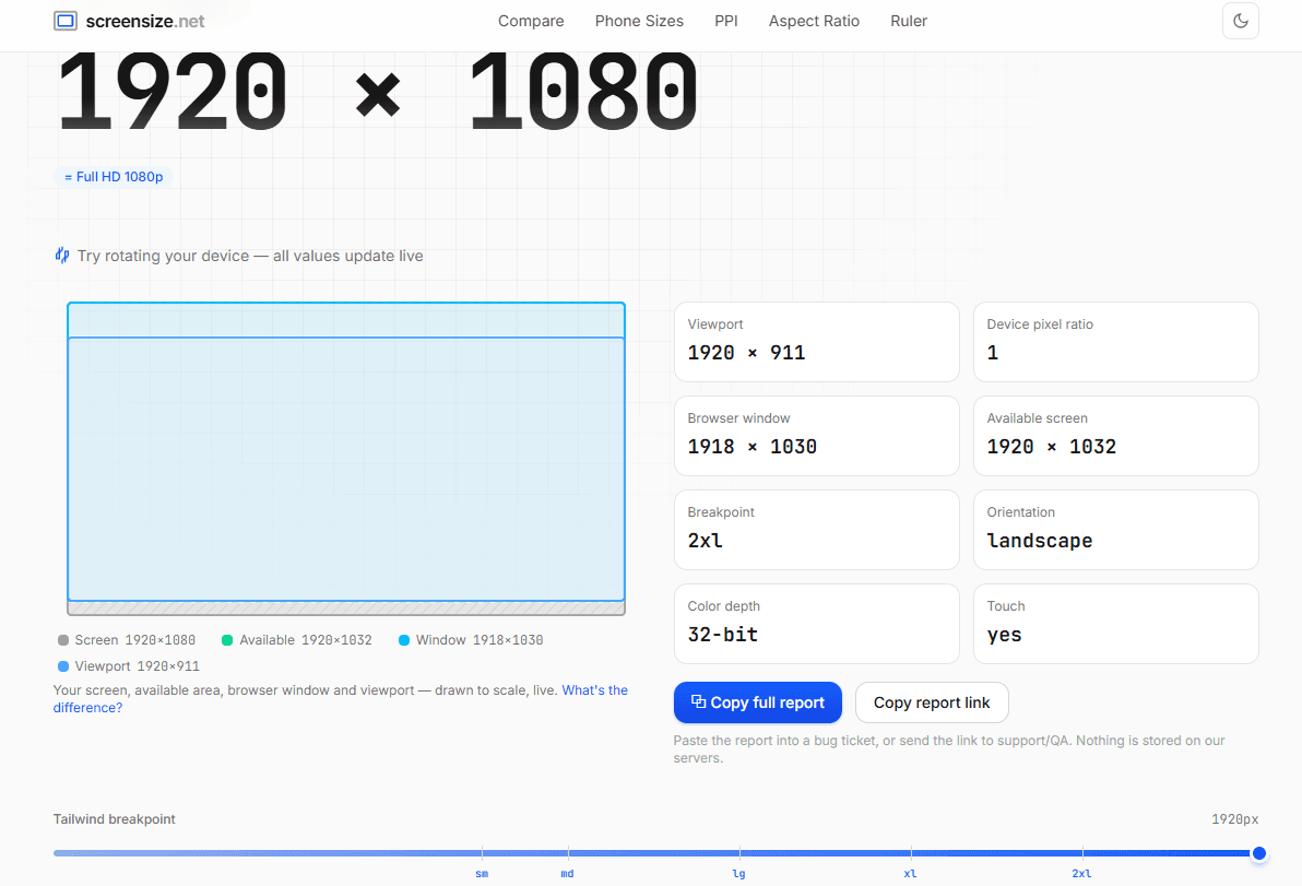
ScreenSize is a comprehensive, ad-free suite of display testing and calculation utilities built for web developers and UI/UX designers. It provides an all-in-one platform to instantly inspect CSS viewports, accurately calculate screen pixel density (PPI/DPI), find precise aspect ratios, and check device pixel ratios (DPR). The tool also features detailed, filterable specification and comparison charts for popular smartphones, tablets, and desktop monitors.
44 people supporting this launch
4.8
6 ratings


AI video with native sound, paid per clip. Nothing stored.

A calmer Mac menu bar, one click away.

Enterprise Software. Intelligent Automation. Global Impact.


Comments
9Really useful tool for front-end work. The live viewport detection is spot on — no more guessing what breakpoint is actually firing. The device comparison charts are a nice touch too, especially filtering by phone vs monitor. Would love to see Tailwind and Bootstrap breakpoints highlighted directly on the viewport display.
Simple idea, but extremely useful. Designers and developers constantly need quick screen dimensions, and having everything in one place saves a lot of time.
Square Foot Calculator helps you calculate area, room size, material needs, and project costs for flooring, paint, tile, roofing, landscaping, and more.
ScreenSize looks very useful for web developers and UI/UX designers who need quick viewport, DPI/PPI, aspect ratio, and device pixel ratio checks in one place. I like that it combines multiple display-testing utilities instead of making users switch between different tools. A helpful improvement could be adding a few visual examples or common testing scenarios for responsive design workflows.
Adding some common visual presets or scenarios is a great idea to make it even more plug-and-play. I'll look into adding that!
i write a16z speedrun scout checks within 24hours | Co-Founder & CTO at Dial AI
The viewport detection updates live as you resize - huge for catching responsive design breakpoints in action. Instead of bouncing between a dozen device spec sheets, everything's here. The DPR checker is the real time saver though - getting exact pixel ratios for image optimization on high-density screens usually means digging through manufacturer datasheets. Having it instantly available means designers actually use it instead of guessing.
The device comparison charts and the built-in online ruler are excellent touches for UI/UX prototyping. Love how clean and distraction-free the dashboard looks. Definitely bookmarking this
Building Casheva - free financial calculators in Spanish for Argentina, Spain and Mexico.
The PPI calculator with dot pitch output is genuinely useful. I build web calculators myself and testing them across viewports is always a pain, so having viewport detection, DPR check and the device comparison charts in one ad-free place saves real time. Suggestion: a small embeddable widget of the viewport tester would be great for docs pages.
Thanks Alexis!The embeddable widget is a brilliant suggestion for docs and blogs—I'm definitely going to explore how to ship a clean, bloat-free iframe for that.
Software engineer
this is very useful for any web frontend or mobile work - thanks very much!